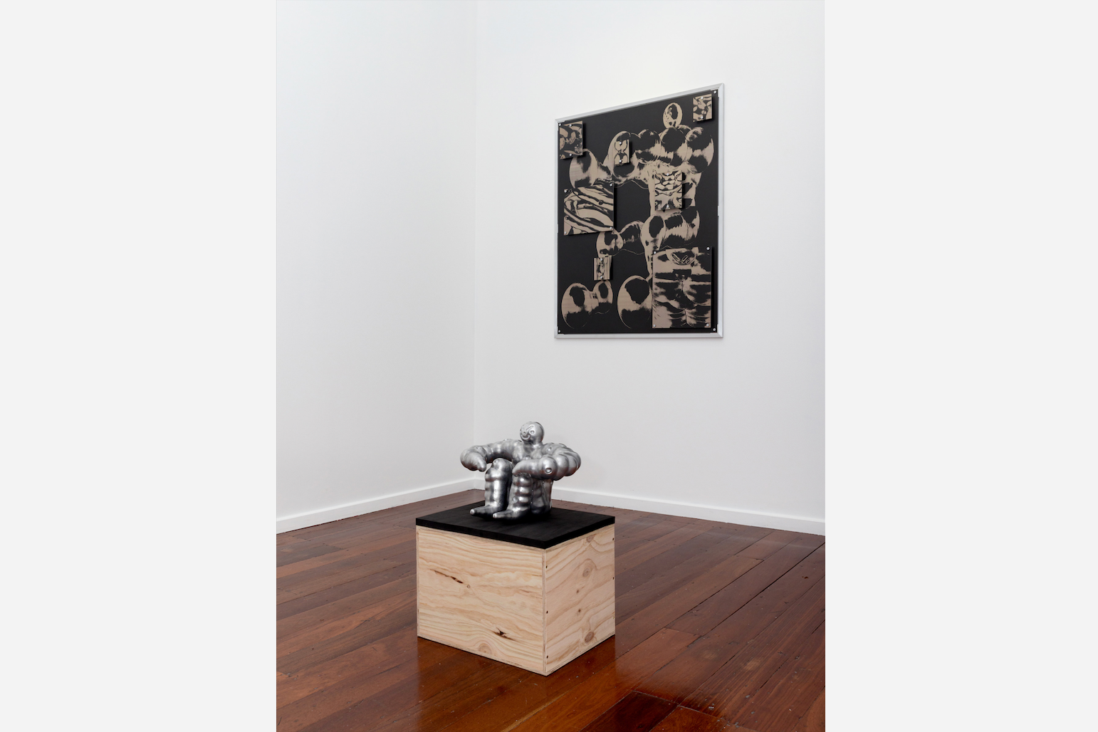


Tim Meakins’ latest exhibition, Body Mould, at Sweet Pea, sees him make a significant stylistic departure from the contoured, highly designed imagery that has typified his work for several years. For Body Mould, Meakins dispenses with the bold colours and glossy car-paint finishes, opting for more austere, industrial, and coarse visuals. Three bulky statuettes are sat atop pine crates—each a muscular figure with facial features resembling the masks of Mexican wrestlers—cast in solid aluminium. Headbody, the first encountered upon entry, is shaped like some kind of artisan kettlebell (and after attempting to deadlift one of these sculptures at Meakins invitation, I can attest to it weighing much like one as well)—its bubbled “arms”, raised above a smiling-yet-sinister face, conjoin into a cauliflower-like top section. Deflated is another of Meakins’ muscle men, with its bloated limbs spread-eagled. A tumid head pops out from its nodular body, either gleeful or grimacing—it’s hard to say. Finally, Floor Exercise sits at the back of the gallery. To me, this is the most interesting of the trio. Frozen in an awkward squat, its figure recalls the designs of Japanese tin toys popular in the 1960s—most specifically, those of manufacturer Nomura, the producer of toy manga characters like Tetsujin 28. Perhaps the most interesting aspect of Meakins’ sculptures, much like those worn out antique pressed tin toys, is the uneasy ambivalence they evoke. Gone are the overtly cutesy styles for which Meakins is best known. Instead, this bulbous troika are spooky—their granular, unpolished finishes belie their smiles and muscles.
While it is impossible to shake that these sculptures are meticulous fabrications, designed in some AutoCAD-like program, they maintain an appealing tactility, thanks to Meakins’ restraint. Choosing to leave the surfaces of his sculptures unpainted—at odds with the glossy acrylic and buffed sheen of his previous work—, their gnarled, uneven surfaces help to form a paradoxical relationship with their forms (i.e. the toy-ish object with its rough industrial finish). For Meakins, this represents a shift away from former literalisms toward fresh ambiguities.
Across from the sculptures are two major wall pieces, Vein and Blow Out. Again, both works are markedly different to what one would anticipate from Meakins. Unlike his previous 2D works, with their flat planes of summery colours and sharp, minimalist contours, these images are grainy, dark, and duotone. Vein consists of three panels—two smaller panels affixed to the larger, main panel—and depicts a sepia abstraction of one of the muscle men. Blow Out is the more interesting of the two, almost recalling the strange antiquated sci-fi designs of tin toy packaging, reimagined with a sort of ‘nu metal’ aesthetic sensibility. It is the dark, techie aesthetic that also recalls Dan McCabe’s Moore Contemporary exhibition of 2023, Art as Asset. Yet, unlike McCabe’s tech-collages that cleverly reference art history heists and controversies (without descending into self-absorbed art-wankery, I should add!), Meakins’ work remains wedded to his own personal imagery—a sort of introspection that, not to demean, comes across as self-referential re-branding rather than presenting a cohesive or rigorous artistic rationale. This “rebranding” of familiar subjects into a new post-Dark Web aesthetic remains unaccounted for in the exhibition. Or perhaps, to take the counterfactual, is the point to simply reimagine Meakins’ sunny muscle men in a more sinister light? Is Body Mould the evil Shadow to Meakins’ more familiar Sonic?
The less successful works, to my mind, include a small wall mounted laser-cut trinket titled Lock, a miniature muscle man maquette that is more typical of Meakins’ design work, and a video showing Meakins ascending and descending a ladder in and out of his attic. Both works appear out-of-key with the tone of the surrounding work. Experimentations, perhaps? It’s hard to say.
What makes Body Mould perhaps one of Meakins’ most successful exhibitions is his embrace of the kind of visual ambiguity that has the best of his works lingering in the mind after one’s visit to the gallery. It represents a shift away from a design-heavy literalism that has held Meakins back in some respects, and a (yet-to-be-fully-realised) step toward a more interesting visual ambiguity, where materials and images are allowed to work on us in dissonant ways. What leaves me unfulfilled is the absence of a critical examination of what brought about this shift. For over seven years, Meakins has developed a recognisable and narrow cache of motifs, design elements, and subjects. Over those same intervening years, many of these visual elements have become increasingly ubiquitous, both locally and nationally, in design and marketing (every bagel shop and mortgage house seem to have a cute, contoured, anthropomorphic mascot these days). As this kind of imagery becomes so inseparable from marketing in our consciousness, is it harder for such images to be readily understood in alternate ways? In this sense, might Body Mouldrepresent not only a departure from Meakins’ former design-oriented style, but also as a defence against his work being understood as such? If this was part of the ambition, perhaps a greater critique or examination of the mechanisms that have brought this shift about may have addressed such unanswered questions.
Tim Meakins, Body Mould, Sweet Pea, 12 October 2024 – 23 November 2024.
Image credits:
1. Installation photograph of Tim Meakins’ Body Mould at Sweet Pea. Photograph by Aaron Claringbold.
2. Installation photograph of Tim Meakins’ Body Mould at Sweet Pea. Photograph by Aaron Webber.
3. Installation photograph of Tim Meakins’ Body Mould at Sweet Pea. Photograph by Aaron Claringbold.
