Dispatch Review respectfully acknowledges the Whadjuk people as the traditional owners and custodians of the lands upon which we live and work. We pay deep respect to Elders past and present. Always was, always will be Aboriginal land.
Reviews:
- Feel Bad Hit of the Summer Pt. 2, by Francis Russell.
- Isn’t there someone you forgot to ask? by Amy Hickman.
- Isabel Bereczky: Outsole, by Chelsea Hopper.
- On Dreaming, by Stirling Kain.
- Feel Bad Hit of the Summer Pt. 1, by Francis Russell.
- Lucas “Granpa” Abela at _____g.s, by Nalinie See.
- Alana Hunt, A Deceptively Simple Need, PICA, by Marco Marcon.
- Wang Qingsong’s Everlasting Inscription, by Sam Beard.
- Dispatch Review's 2025 Wrap-up.
- Ripairian: Imprinting the Living Landscape, by Annette Peterson.
- Corpse-Watching Comes to Perth, by Riley Landau.
- Queering Kin: Amos Gebhardt’s Family Portrait by Riley Landau.
- Forget AI by Francis Russell.
- Acid Utopia: Judgment Day by Aimee Dodds.
- Mollescent Irritant: Liam Gillick at Disneyland Paris by Aimee Dodds.
- Kieron Broadhurst and Ash Tower: Border Chronicle by Soph Grey.
- Nan Goldin, Voyeurism, and the NGA by Jess van Heerden.
- Bombard the Headquarters: An Interview with Linda Jaivin by Sam Beard.
- Hatched Dispatched 2025, by Maraya Takoniatis, Riley Landau, Nalinie See, Kye Fisher, and Jess van Heerden.
- Sneak Out by Tara Heffernan.
- By Chance, Li Gang by Sam Beard.
- Nazila Jahangir, Immigration by Sam Beard.
- Regenerative Strategies: A Celestial Reflection by Jess van Heerden.
- Cast in (Mostly) Bronze at AGWA by Riley Landau.
- Missed Shows and Mini Reviews by Darren Jorgensen, Riley Landau, Amelia Birch, and Sam Beard.
- 2025 Power 100, by Dispatch Review.
- Dan Bourke, Keywords, AVA by Francis Russell.
- Revivification at AGWA by Angus Bowskill.
- The Australian Dream and other Fictions by Jess van Heerden.
- The Vessel Report by Sam Beard.
- Jacob Kotzee’s flowerfield by Scott Price.
- Jeff Gibson: False Gestalt by Francis Russell.
- Skyward, or Boonji Spaceman and the Giant Kebab by Nick FitzPatrick.
- Sam Bloor and Jesse Marlow: Street Posters 2020–2025 by Sam Beard.
- Mervyn Street: Stolen Wages by Darren Jorgensen.
- 100 Sculpture Ideas for Sculptures by the Sea by Rainy Colbert.
- Kate Mitchell’s Idea Induction by Amelia Birch.
- Mai Nguyễn-Long’s Doba Nation by Sam Beard.
- A conversation with Jo Darbyshire, by Stirling Kain.
- Dispatch Review’s 2024 Wrap-up.
- The people yearn... by Max Vickery and Erin Russell.
- An invitation to dance by Sam Beard.
- We Talk, We Discuss: An Interview with Taring Padi by Max Vickery.
- AGWA x PrideFEST by Felicity Bean.
- Tim Meakins, Body Mould by Sam Beard.
- Nick FitzPatrick, Hero Image by Francis Russell.
- Jacob Kotzee, Arrangements by Dan Glover.
- Hollow Icons: Desmond Mah at Mossenson by Darren Jorgensen.
- Pilgrimage: An interview with Vedika Rampal.
- The UnAustralian: Doubling Double Nation – An interview with Rex Butler.
- Negative Criticism: A Year of Dispatch Review by Tara Heffernan.
- Custodians as Reverse Monument by Darren Jorgensen.
- End of History – LWAG by Francis Russell.
- Hatched Dispatched 2024 by Dan Glover, Jess van Heerden, Nalinie See & Sam Beard.
- David Bromfield: A critic at large and ‘Where did the artists go?’
- Me, Also Me by Sam Beard.
- Paper Trails Between Lion and Swan by Sam Beard.
- Ceramically Speaking by Ben Yaxley.
- The Strelley Mob by Sam Harper.
- Rone: The Mighty Success by Leslie Thompson.
- Paper Trails: An interview with Yeo Chee Kiong by Sam Beard.
- 2024 Power 100 by Dispatch Review.
- Foresight & Fiction by Ben Yaxley.
- Twin Peaks Was 30 by Matthew Taggart.
- Breaking News: It’s Rone! by Sam Beard.
- Look, looking at Anna Park by Amelia Birch.
- The Fan by Francis Russell.
- Follower, Leader by Maraya Takoniatis.
- Wanneroo Warholamania by Sam Beard.
- Death Metal Summer by Sam Beard.
- Players, Places: Reprised, Renewed, Reviewed by Aimee Dodds.
- Scholtz: Two Worlds Apart by Corderoy, Fisher, Flaherty, Wilson, Fletcher, Jorgensen, & Glover.
- Partial Sightings by Sam Beard.
- True! Crime. by Aimee Dodds.
- The Human Condition by Rex Butler.
- Rebecca Baumann’s Light Event by Sam Beard.
- Rejoinder: Archival / Activism by Max Vickery.
- Access and Denial in The Purple Shall Govern by Jess van Heerden.
- 4Spells by Sam Beard.
- Abstract art, DMT capitalism and the ugliness of David Attwood’s paintings
by Darren Jorgensen. - Unearthing new epistemologies of extraction by Samuel Beilby.
- Seek Wisdom by Max Vickery.
- Something for Everyone by Sam Beard.
- Violent Sludge by Aimee Dodds.
- State of Abstraction by Francis Russell.
- Double Histories: Special Issue, with texts by Ian McLean, Terry Smith, and Darren Jorgensen & Sam Beard.
- Six Missing Shows by Sam Beard.
- What We Memorialise by Max Vickery.
- At the End of the Land by Amelia Birch.
- The beautiful is useful by Sam Beard.
- ām / ammā / mā maram by Zali Morgan.
- Making Ground, Breaking Ground by Maraya Takoniatis.
- Art as Asset by Sam Beard.
- Cactus Malpractice by Aimee Dodds.
- Sweet sweet pea by Sam Beard.
- COBRA by Francis Russell.
- PICA Barn by Sam Beard.
- Gallery Hotel Metro by Aimee Dodds.
- A Stroll Through the Sacred, Profane, and Bizarre by Samuel Beilby.
- Filling in the Gaps at Spacingout by Maraya Takoniatis.
- Disneyland Cosmoplitanism by Sam Beard.
- Discovering Revenue by Amelia Birch.
- Uncomfortable Borrowing by Jess van Heerden.
- It’s Not That Strange by Stirling Kain.
- Hatched Dispatched 2023 by Sam Beard & Aimee Dodds.
- Fuck the Class System by Jess van Heerden, Jacinta Posik, Darren Jorgensen, et al.
- Wild About Nothing by Sam Beard.
- Paranoiac, Peripatetic: Pet Projects by Aimee Dodds.
- An Odd Moment for Women’s Art by Maraya Takoniatis.
- Transmutations by Sam Beard.
- The Post-Vandal by Sam Beard.
- Art Thugs and Humbugs by Max Vickery.
- Disneyland, Paris, Ardross and the artworld by Darren Jorgensen.
- Bizarrely, A Biennale by Aimee Dodds.
- Venus in Tullamarine by Sam Beard.
- Weird Rituals by Sam Beard.
- Random Cube by Francis Russell.
- Yeah, Nah, Rockpool by Aimee Dodds.
- Towards a Blind Horizon by Kieron Broadhurst.
- Being Realistic by Sam Beard.
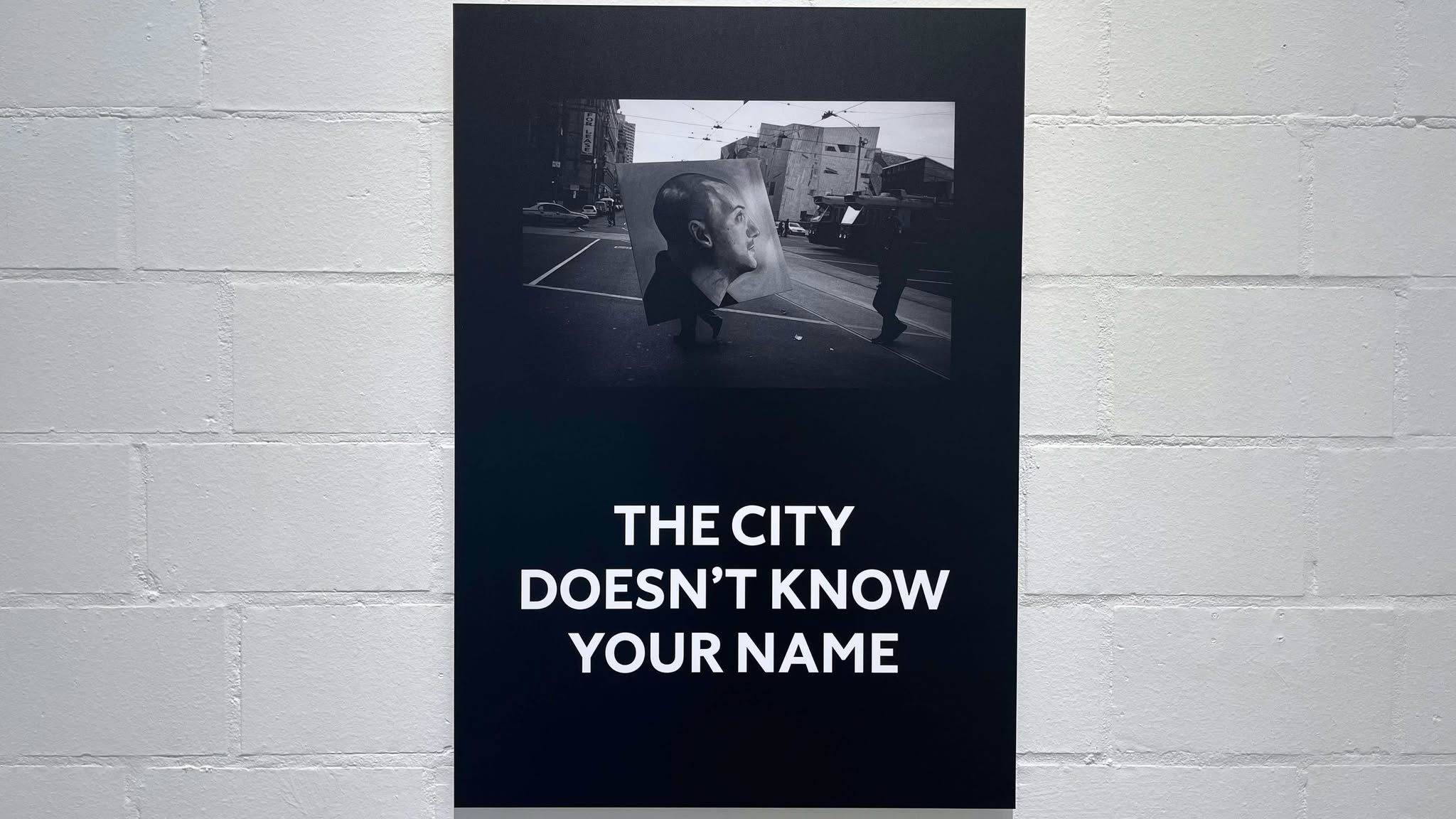

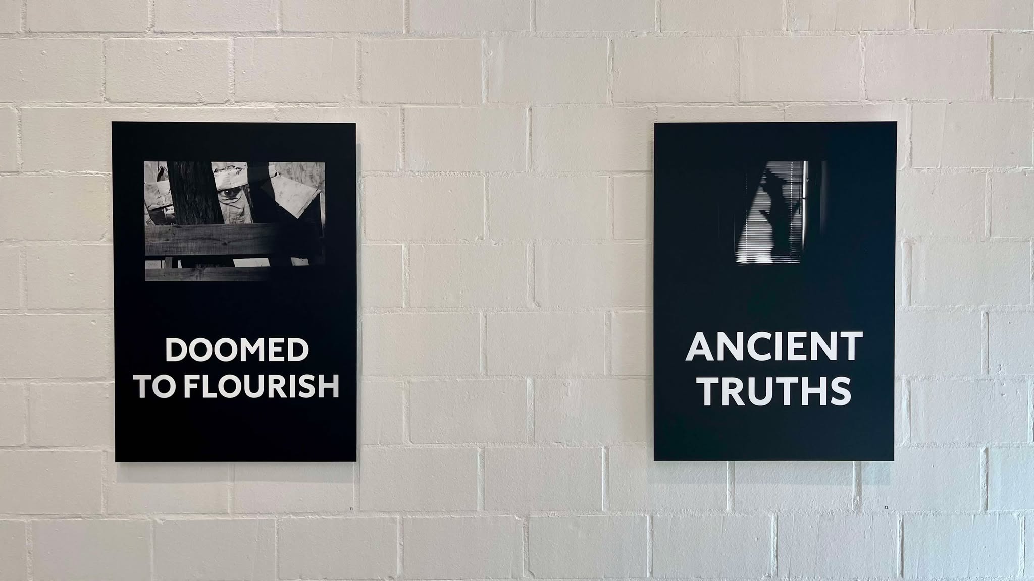
For fans of Jesse Marlow’s street photography, the images in Street Posters 2020–2025 will appear familiar. Perhaps not only because they’ve been postered around Perth and Melbourne in the format presented in this exhibition (that is, accompanied by text by artist Sam Bloor), but because the photographs are from a series Marlow shot between 1998 and 2004, since published in his 2021 photobook Second City.[1] Bloor and Marlow began collaborating during the 2020 Covid-19 lockdowns, which resulted in a selection of Marlow’s black and white street photographs paired with Bloor’s characteristic sans serif aphorisms. These designs—images and texts—were then printed and pasted as large posters around the streets of Melbourne and Perth (and Fremantle, on the old Woolstores building, which doubles as a popular postering spot). Now, for Street Posters 2020–2025, held at Kolbusz Space, the posters are (re)presented as archival prints on aluminium, in editions of five (‘ready to hang’, as the room sheet notes) for clientele and fans of the pair’s respective work. This preamble outlines what interests me most about the work, the recycling and reworking of it, which leads me to ask: which iterations are most successful and why?
Before addressing this question or the exhibition itself, here is what one needs to know about these two artists. Jesse Marlow has a storied career as a photographer. Based in Melbourne, Marlow published his first photobook in 2003 (Centre Bounce: Football from Australia’s Heart), followed by his first collection of street photographs, Wounded, in 2005. He has been awarded several notable art and photography prizes, and his work is held in the collections of Monash University, NGV, and the Australian Parliament House. In a review of Marlow’s Second City—the series in question—photographer Doug Spowart notes that the work ‘reveals [Marlow’s] astute observations of the human relationship with and in the urban environment through his use of candid photography approaches.’[2] In an interview with American photographer Blake Andrews, Marlow described how the title for the book (which he began working on during lockdown) came about from ‘the constant reference to Melbourne […] as Australia’s “Second City” during the early Covid-19 reporting. As the editing process progressed, the title took on a whole new meaning, as the distinction between the Melbourne we all know now and those reflected in the photographs […].’[3]
With these two remarks in mind, the synergies with Sam Bloor’s practice may already be apparent. Bloor cut his teeth in Perth’s graffiti scene before transitioning into traditional signwriting techniques. Before long, he began utilising these techniques to present brief phrases on walls and old signage spots around Perth and Fremantle. The evolution of Bloor—from graff scene to text art—was completed through his borrowing from conceptual art of the 1960s and ‘70s. Particularly relevant touchstones seem to be John Baldessari’s Pure Beauty (1968), Lawrence Weiner’s A Stake Set (1969), and Jenny Holzer’s Truisms series (1977–87), specifically the iteration that involved Holzer pasting the Truisms prints around the streets of Manhattan.
The significance of the urban environment for both Marlow and Bloor is signposted before entry. Through the window of Kolbusz Space, a large wraparound print of a photograph of the Bloor / Marlow posters in situ advertises the show to passers-by. To me, this particular rendition—the eclectic street poster—is the most interesting. As editions in the gallery, art objects in their own right, the interplay between mature street photography and youthful aphorism is at best whimsical and at worst perplexing. Some of the aphorisms are perhaps more aptly described as (and I do not mean this in a derogatory sense necessarily) juvenile. This particular mood or overwrought cadence is exemplified in the aphorisms; ‘Fever Dream,’ ‘Doomed to Flourish,’ ‘All My Bright Ideas vs the Sun,’ or ‘The Early Bird Dies on the Way to Work’ are all apt contenders for angsty emo song titles. This may seem dismissive—not so, however—as it is important to assess the text, the image, and their relationship in order to grasp the whole. The aphorisms throughout Street Posters 2020–2025 tinge the photographs with airs of youthful despondence, overwrought poetics, detached ennui, and pub philosophising. These moods are not dissimilar to the subjects of many of Marlow’s images: scenes of city life passing by somewhere between dissociation and contentment. The photographs and texts appear tightly bound together, as opposed to the large-format posters which more boldly asserted themselves in the urban landscape. These pairings may have been more compelling in the gallery context had they been pried apart from one another, freed for the viewer to associate varying texts and photographs.
A friend pointed out another interesting comparator for Bloor’s aphorisms, those by Rirkrit Tiravanija for last year’s Perth Festival. ‘Do we dream under the same sky?’ asked Tiravanija, via billboards and posters, laid out in black sans serif type on stark white backgrounds (the inverse of Bloor’s usual format). In these works, Tiravanija appears to search for a poetic “open-endedness”, encouraging a participatory quality in which the viewer makes up for the ambiguity of the respective aphorism and fills in the blank with a “meaning” of their own. At the time, I concluded that the “open-endedness” of the work was a disguise for its insufficiencies.[4] Perhaps my review unfairly focused on the content of the posters, rather than the effect they might have on unsuspecting viewers going about their business. Instead of thinking through Tiravanija’s work as an art object, but as a sign [5], one can appreciate the need to jar, confuse, or discombobulate with idiosyncratic phrasing. In an environment of competing signs, one might conclude this phrasing is a way to pique interest and ignite questioning in the mind of the viewer. If this is true, their simple design only adds to the curiously conspicuous yet low-key a/effect. On the other hand, interpreted as art objects (perhaps a misreading), or even simply as text, the whimsical naïvety of the signs betrays an awkwardness that is hard to shake. But Tiravanija’s signs remained on the street and not in the gallery. Because of this, I now tend to favour the more generous reading.
For Bloor and Marlow, what were eclectic street posters are now commodities in a gallery. This is by no means an issue in its own right. But devoid of their relationships to adjacent posters, cruddy brick walls, and obscuring street signs, they are isolated and thus the sums of their own parts. Under this spotlight, Bloor’s text-based work never quite transcends its youthful and despondent argot. Compare this with Holzer’s Truisms: Holzer strips the texts of any personal “style”, paring the phrasing back to impersonal, fundamental ideas. In their naked state, the germs of ideas are ready to infect a host—with little concern for their host’s context, surroundings, or interests. It is through the directness and clarity of Holzer’s phrasing, combined with the minimalism of its presentation and the complexities that come with its public display on the streets, that the most interesting qualities of Truisms are formed. Bloor and Tiravanija share an “open-endedness” that Holzer does not, and therefore, we can turn to the pair to understand what Truisms might have been like had it lacked Holzer’s crisp, sharp, and concise phraseology.
Combining such phrasing with images—at least in this context—does not detract from the text. But it does complicate it. This pairing of recycled photographs and texts in such a tight convention as “image on top/caption below” just seems too slick, too formulaic, in the gallery space to yield the kind of perplexed contemplation the works might have provoked in the urban settings where they were initially postered. Or, perhaps the ubiquitous nature of internet memes, aspirational image/text combos, inspirational Kmart posters, or workplace calendar designs, is too great a burden to be borne by the works of Street Posters 2020–2025 in the eyes of this critic. However, their slick presentation, sophisticated photography, and contemporary idioms will undoubtedly find an adoring audience.
Sam Bloor and Jesse Marlow: Street Posters 2020–2025, Kolbusz Space, 15 – 16 March, 2025.
Footnotes:
1. I haven’t yet consulted a copy of Marlow’s Second City, a collection of 44 street photos published by Marlow’s own imprint, Sling Shot Press, to confirm that all the images selected for the Bloor/Marlow collaboration are from the Second City series. However, several certainly are—including some of the most poignant in the exhibition.
2. Spowart, Doug. “Second City by Jesse Marlow – Book Review”, Photo Collective, August 12, 2021. https://photocollective.com.au/book-review/doug-spowart/second-city-by-jesse-marlow-book-review/
3. Andrews, Blake. “Q & A with Jesse Marlow”, blog, April 28, 2021. http://blakeandrews.blogspot.com/2021/04/q-with-jesse-marlow.html
4. See Partial Sightings: Rirkrit Tiravanija in the suburbs, Sam Beard, Dispatch Review. https://dispatchreview.info/Partial-Sightings
5. Rirkrit Tiravanija proposes this very idea in a recent interview with the Louisiana Channel: https://youtu.be/KUYL90wEoYc?si=QmphVKuLITcj4k35
Image credits: Installation photographs of Sam Bloor and Jesse Marlow: Street Posters 2020–2025, Kolbusz Space, 15 – 16 March, 2025. All artwork by Sam Bloor and Jesse Marlow.