Dispatch Review respectfully acknowledges the Whadjuk people as the traditional owners and custodians of the lands upon which we live and work. We pay deep respect to Elders past and present. Always was, always will be Aboriginal land.
Reviews:
- Patches in a Glowing Landscape: A Reading Gregory Pryor’s Huddle Exhibition, by Jonathan W. Marshall.
- Pure Intention: Singapore Biennale 2025–26 by Marco Marcon.
- Gemma Weston, WITNESSING by Sam Beard and Francis Russell.
- Painting Itself: Artist Interviews by Felicity Ostergaard and William Bromage.
- Flooding The Zone by Paul Sutherland.
- Something Old, Something New by Duncan McKay.
- Theo Koning by Marco Marcon.
- Jacob Kotzee: Stimela by Grace Coppola.
- Feel Bad Hit of the Summer Pt. 2 by Francis Russell.
- Isn’t there someone you forgot to ask? by Amy Hickman.
- Isabel Bereczky: Outsole by Chelsea Hopper.
- On Dreaming by Stirling Kain.
- Feel Bad Hit of the Summer Pt. 1 by Francis Russell.
- Lucas “Granpa” Abela at _____g.s by Nalinie See.
- Alana Hunt, A Deceptively Simple Need, PICA by Marco Marcon.
- Wang Qingsong’s Everlasting Inscription by Sam Beard.
- Dispatch Review's 2025 Wrap-up.
- Ripairian: Imprinting the Living Landscape by Annette Peterson.
- Corpse-Watching Comes to Perth by Riley Landau.
- Queering Kin: Amos Gebhardt’s Family Portrait by Riley Landau.
- Forget AI by Francis Russell.
- Acid Utopia: Judgment Day by Aimee Dodds.
- Mollescent Irritant: Liam Gillick at Disneyland Paris by Aimee Dodds.
- Kieron Broadhurst and Ash Tower: Border Chronicle by Soph Grey.
- Nan Goldin, Voyeurism, and the NGA by Jess van Heerden.
- Bombard the Headquarters: An Interview with Linda Jaivin by Sam Beard.
- Hatched Dispatched 2025, by Maraya Takoniatis, Riley Landau, Nalinie See, Kye Fisher, and Jess van Heerden.
- Sneak Out by Tara Heffernan.
- By Chance, Li Gang by Sam Beard.
- Nazila Jahangir, Immigration by Sam Beard.
- Regenerative Strategies: A Celestial Reflection by Jess van Heerden.
- Cast in (Mostly) Bronze at AGWA by Riley Landau.
- Missed Shows and Mini Reviews by Darren Jorgensen, Riley Landau, Amelia Birch, and Sam Beard.
- 2025 Power 100, by Dispatch Review.
- Dan Bourke, Keywords, AVA by Francis Russell.
- Revivification at AGWA by Angus Bowskill.
- The Australian Dream and other Fictions by Jess van Heerden.
- The Vessel Report by Sam Beard.
- Jacob Kotzee’s flowerfield by Scott Price.
- Jeff Gibson: False Gestalt by Francis Russell.
- Skyward, or Boonji Spaceman and the Giant Kebab by Nick FitzPatrick.
- Sam Bloor and Jesse Marlow: Street Posters 2020–2025 by Sam Beard.
- Mervyn Street: Stolen Wages by Darren Jorgensen.
- 100 Sculpture Ideas for Sculptures by the Sea by Rainy Colbert.
- Kate Mitchell’s Idea Induction by Amelia Birch.
- Mai Nguyễn-Long’s Doba Nation by Sam Beard.
- A conversation with Jo Darbyshire, by Stirling Kain.
- Dispatch Review’s 2024 Wrap-up.
- The people yearn... by Max Vickery and Erin Russell.
- An invitation to dance by Sam Beard.
- We Talk, We Discuss: An Interview with Taring Padi by Max Vickery.
- AGWA x PrideFEST by Felicity Bean.
- Tim Meakins, Body Mould by Sam Beard.
- Nick FitzPatrick, Hero Image by Francis Russell.
- Jacob Kotzee, Arrangements by Dan Glover.
- Hollow Icons: Desmond Mah at Mossenson by Darren Jorgensen.
- Pilgrimage: An interview with Vedika Rampal.
- The UnAustralian: Doubling Double Nation – An interview with Rex Butler.
- Negative Criticism: A Year of Dispatch Review by Tara Heffernan.
- Custodians as Reverse Monument by Darren Jorgensen.
- End of History – LWAG by Francis Russell.
- Hatched Dispatched 2024 by Dan Glover, Jess van Heerden, Nalinie See & Sam Beard.
- David Bromfield: A critic at large and ‘Where did the artists go?’
- Me, Also Me by Sam Beard.
- Paper Trails Between Lion and Swan by Sam Beard.
- Ceramically Speaking by Ben Yaxley.
- The Strelley Mob by Sam Harper.
- Rone: The Mighty Success by Leslie Thompson.
- Paper Trails: An interview with Yeo Chee Kiong by Sam Beard.
- 2024 Power 100 by Dispatch Review.
- Foresight & Fiction by Ben Yaxley.
- Twin Peaks Was 30 by Matthew Taggart.
- Breaking News: It’s Rone! by Sam Beard.
- Look, looking at Anna Park by Amelia Birch.
- The Fan by Francis Russell.
- Follower, Leader by Maraya Takoniatis.
- Wanneroo Warholamania by Sam Beard.
- Death Metal Summer by Sam Beard.
- Players, Places: Reprised, Renewed, Reviewed by Aimee Dodds.
- Scholtz: Two Worlds Apart by Corderoy, Fisher, Flaherty, Wilson, Fletcher, Jorgensen, & Glover.
- Partial Sightings by Sam Beard.
- True! Crime. by Aimee Dodds.
- The Human Condition by Rex Butler.
- Rebecca Baumann’s Light Event by Sam Beard.
- Rejoinder: Archival / Activism by Max Vickery.
- Access and Denial in The Purple Shall Govern by Jess van Heerden.
- 4Spells by Sam Beard.
- Abstract art, DMT capitalism and the ugliness of David Attwood’s paintings
by Darren Jorgensen. - Unearthing new epistemologies of extraction by Samuel Beilby.
- Seek Wisdom by Max Vickery.
- Something for Everyone by Sam Beard.
- Violent Sludge by Aimee Dodds.
- State of Abstraction by Francis Russell.
- Double Histories: Special Issue, with texts by Ian McLean, Terry Smith, and Darren Jorgensen & Sam Beard.
- Six Missing Shows by Sam Beard.
- What We Memorialise by Max Vickery.
- At the End of the Land by Amelia Birch.
- The beautiful is useful by Sam Beard.
- ām / ammā / mā maram by Zali Morgan.
- Making Ground, Breaking Ground by Maraya Takoniatis.
- Art as Asset by Sam Beard.
- Cactus Malpractice by Aimee Dodds.
- Sweet sweet pea by Sam Beard.
- COBRA by Francis Russell.
- PICA Barn by Sam Beard.
- Gallery Hotel Metro by Aimee Dodds.
- A Stroll Through the Sacred, Profane, and Bizarre by Samuel Beilby.
- Filling in the Gaps at Spacingout by Maraya Takoniatis.
- Disneyland Cosmoplitanism by Sam Beard.
- Discovering Revenue by Amelia Birch.
- Uncomfortable Borrowing by Jess van Heerden.
- It’s Not That Strange by Stirling Kain.
- Hatched Dispatched 2023 by Sam Beard & Aimee Dodds.
- Fuck the Class System by Jess van Heerden, Jacinta Posik, Darren Jorgensen, et al.
- Wild About Nothing by Sam Beard.
- Paranoiac, Peripatetic: Pet Projects by Aimee Dodds.
- An Odd Moment for Women’s Art by Maraya Takoniatis.
- Transmutations by Sam Beard.
- The Post-Vandal by Sam Beard.
- Art Thugs and Humbugs by Max Vickery.
- Disneyland, Paris, Ardross and the artworld by Darren Jorgensen.
- Bizarrely, A Biennale by Aimee Dodds.
- Venus in Tullamarine by Sam Beard.
- Weird Rituals by Sam Beard.
- Random Cube by Francis Russell.
- Yeah, Nah, Rockpool by Aimee Dodds.
- Towards a Blind Horizon by Kieron Broadhurst.
- Being Realistic by Sam Beard.
The
Australian Dream and other Fictions – Andy Quilty’s Happy Meals & Scooter Skids: Art from
the outer suburbs at FORM
Gallery
Saturday, 17 May 2025
Andy Quilty is not into frills. Happy Meals & Scooter Skids: Art from
the outer suburbs takes pride in its resolved rawness. It cuts through the
C.R.AP. (classism, righteousness, and
anti-pluralism) that has a tendency to haunt the scene we know and love. Yet,
there is no sign of the toxic masculinity that such violently grounded,
formally focused work frequently harbours. Instead, we see worries, triumphs,
wishes, and walks home beaming from white cube walls in tongue-in-cheek
earnestness. The Perth Festival project represents a collaboration between
prolific so-called Western Australian artist and educator Andy Quilty and
students from three of Boorloo’s outer suburban schools, Youth Futures
Community School Midland, Armadale Senior High School, and Warnbro Community
High School. The FORM exhibition runs alongside its counterpart at Midland
Junction Arts Centre and will later tour to the Kim Fletcher Gallery in
Armadale, finally ending its run in Rockingham (where Quilty is based and has
lived all his life).
Quilty’s three solo works, Car Crash (“I’m gonna call Howard Sattler”) (Safety Bay Rd), Flag Man (Frangipanis) (Axminister St), and Surf Bogan (Shark Chopper get F***ed) (Palermo Cove) are a mesmerising force. Clashing elements sit at odds to create densely layered chaos. Surf Bogan, for example, is something like a warped vignette with its careful ink shading pressing inwards from the upper right and bottom left-hand corners. Yet this gradient frame cannot contain the formal and tonal explosions that undermine the paper’s rectangular frame. This work is more portal than page. Expressive, directional linework instils the fidgety figures with movement and life. The varied marks and dense layering that renders the ambiguous subject matter, creates the impression that it cannot hold still. Scratched markings give the impression that the subject matter is uncertain in its person or objecthood, as if the disembodied screaming mouth, laser-shooting eyes, and raised middle finger only rest briefly in formation and could flicker quickly back into unrecognisable abstraction. The triad of improvised drypoint scratchings reflects what Quilty refers to as ‘outer suburban archetypes’, critical of lingering stigmatisation that outer suburban experience frequently encounters. Exhibition text explains that Flag Man and Surf Bogan describe persons the artist passed when driving to the beach. The third drypoint, Car Crash, emerges in response to an informative experience for Quilty. A single-vehicle crash tragically killed his teenage friend—incorrectly reported in the news as a stolen vehicle in accordance with negative assumptions frequently made about outer suburban youth. Quilty explains that while working as a labourer after finishing high school, his boss (who was aware of Quilty’s close friendship with the deceased) told him casually that he attended the crash as a volunteer firefighter and his friend’s body was split in half. The artist recalls ‘that he so nonchalantly shared this with me, indicated the frequency with which he attended these scenes and implied the notion that I have come across in outer suburbia: that your feelings can go and get f***ed.’
Quilty’s mundane, suburban subject matter—with works featuring metamorphosed sneakers, Quicksilver-esque designs, crucifixes, eyes, knees, mechanical parts, and waves—offers points of departure from which sets of encoded beliefs are unravelled. It is evident that Quilty has likewise encouraged students to do the same, drawing from their day-to-day experiences and trials to inform their artmaking. Visualising daily experiences—without dressing them up for viewers—is an impulse throughout the exhibition. Works feature scattered assortments of popular cartoons, barking dogs, and fast-food products in a manner that mimics the meandering jumping of conversations between close friends. Like exchanges that occur within intimate friendships, works range from addressing pressing fears—like looming financial pressures, living up to a family member’s expectations, and the drive to make sense of oneself – to trivial toss-ups like what the change in your back pocket will get you for dinner. Also apparent throughout the exhibition is the influence of the experimentalism with which Quilty approaches mark-making. Quilty’s skill as an artist is matched by his capacity to inspire and guide as an educator. The most informative class I took during my undergraduate degree was Quilty’s Drawing Foundations. Whether peppering A2 sheets with staccato, easel-rocking pencil jabs, turning the pencil around to its but and producing blunt, red-tainted impressions, or taking up the neon pastel just handed to him by a volunteer and slashing across a delicately shaded biro portrait (to a chorus of sharp, auditable gasps), his passion for the mark was infectious. It is clear in Happy Meals and Scooter Skids that the same fever has taken hold. Each work contains evidence of unique assemblages of delicately twisting wrists, careful blocking-out, haphazard rubbing, slow shading, tessellating pressure, and decisive linework.
Kaden’s Police, the first work to greet visitors, is a graphite and gouache monotype print on Fabriano paper. It contains a carefully rendered police van, complete with dark hubcaps, tinted windows, and the tell-tale checkered stripe. Yet the law-and-orderly scene is inverted in two fell swoops. Confident curves—perhaps traces of a side-held pencil or a blunt plastic item—mimic burnouts’ inconsistent scorch mark remanence. Combined with the van’s positioning in the upper third of the page, this clever variation gives the probably stolen car a burst of explosive movement. Untitled, Precious, Kyle, Chase, and Ashton’s collaborative ink monotype and drypoint print from found cardboard on paper, adopts a different approach altogether. The 84 x 59.5 cm page encloses several distinct prints that clash and harmonise in turn to create an unpredictable synthesis of implied textures. The image celebrates imperfection to indicate the past lives of the recycled material employed in the print’s making. Clearly rendered in ink, the imprint of torn paper at the centre and bottom left of the work leaves a particularly striking gradient beside jet-black ink blocks. In the prints that make up the right section of the work, carefully sketched figurative drawings tumble into abstraction through layers of interlocking linework. The experimentation continues with a series of five recycled McDonalds packaging monoprints. Rima’s Medium Fries, for example, is an ink monotype that interrupts the smooth surface of McDonald’s packaging with soft, wiggly swirls, boldly skeltered linework, and assertive fingerprints. Medium Fries sits adjacent to Kaden’s quartet of oil marker and solvent transfer on Fabriano paper, LAW and ORDER, HOME OWNER, PATROLE, and INSURANCE. Kaden, whose family Rottweiler is coincidently walked past Andy’s house most days, has created a series of striking portraits. Minimal linework and shading suggest the curves of noses, cheekbones, and tightly sealed lips or downcast eyes. Each expressive face is superimposed over images that might be grouped as outer suburban iconography, including an aging Ford, a police car, and a single-story, tree-less property with a neatly kept lawn.
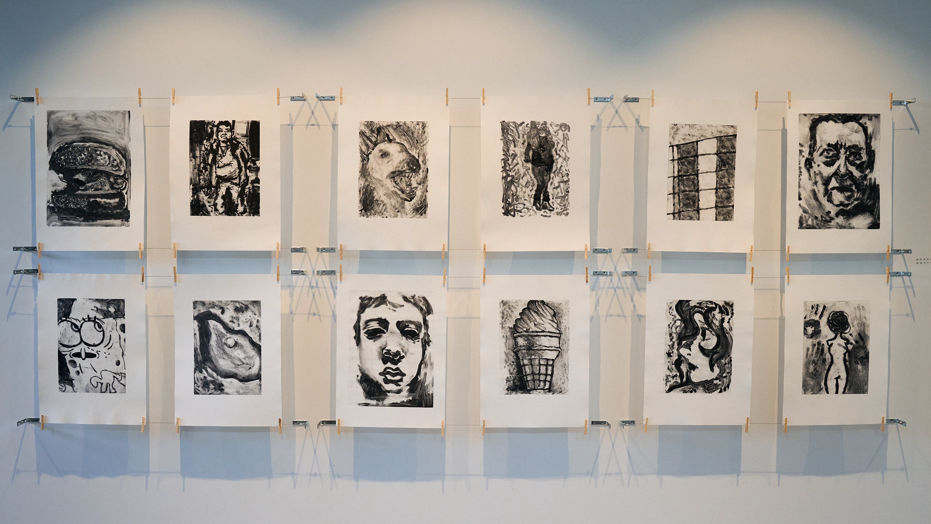
A group show featuring collaborative and individual works by teenage high school students is fated to contain some variance. Remarkably, however, not a single work of the forty-five selected contains homogenous mark-making. Artistic inventiveness and creative approaches make each work an interesting and sophisticated formal investigation. This implicit playfulness should not be taken to suggest, however, that the content is not taken seriously by Quilty or the student artists. While often depicted cheekily, students’ day-to-day experiences are not dismissed as insignificant or ridiculed in a The Castle-esque manner of quasi-sincerity (to draw from Quilty’s analysis of the popular film in his masters thesis). This is felt in the pointed sense of ‘outside-in’ that characterises the exhibition, a sensation that is far from coincidental. Although holding their own as formally innovative fine art objects, it feels as if these works have been brought into the gallery space upon relocation from alternative environments, ‘out there’, to which they belong. Quilty and Andrew Nicholls’ (who worked on the show as supporting curator) use of crude construction materials to hang works further encourages one to notice the disparity between the mundane, sometimes gritty realities of outer suburban kids and the imagery that typically graces gallery walls. Is it not a curious conditionality that allows many so-called Australian gallery goers to cling to a supposedly collective (highly problematic) hills hoist heritage, yet find themselves surprised to meet such down-to-earth subject matter in a gallery context? This irony is not lost on Quilty.
Beneath the exhibition’s laid-back façade is an examination of lingering prejudice, so fittingly placed in Claremont, the beating heart of Perth’s upper classes. Quilty’s project reminds art viewers of the often-unspoken class boundaries we like to think have been dissolved. Happy Meals & Scooter Skids is a mark-making masterclass, but equally, beneath the fun and games, addresses patterns of exclusion within art world mechanisms. It asks, more simply, who is actually welcome.
Image credits:
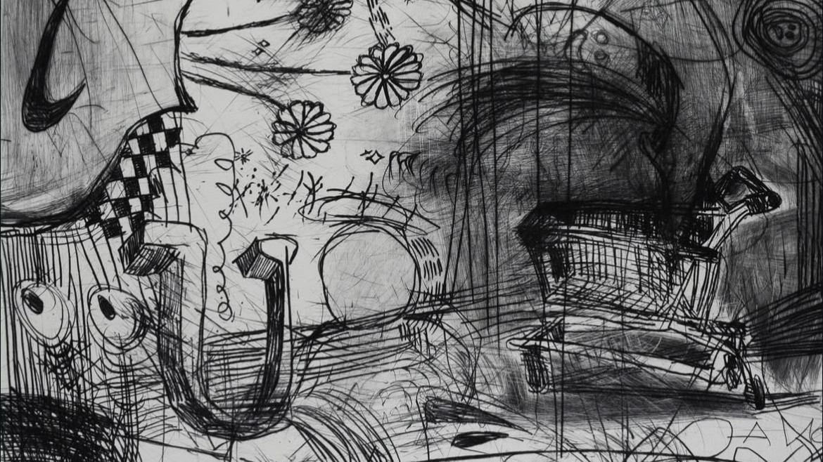
1. Andy Quilty and Armadale Senior High School Students, Nike flowers and shopping trolley (detail), 2024, drypoint print on Fabriano paper, 76 x 56 cm.
2. Courtesy of FORM Gallery.
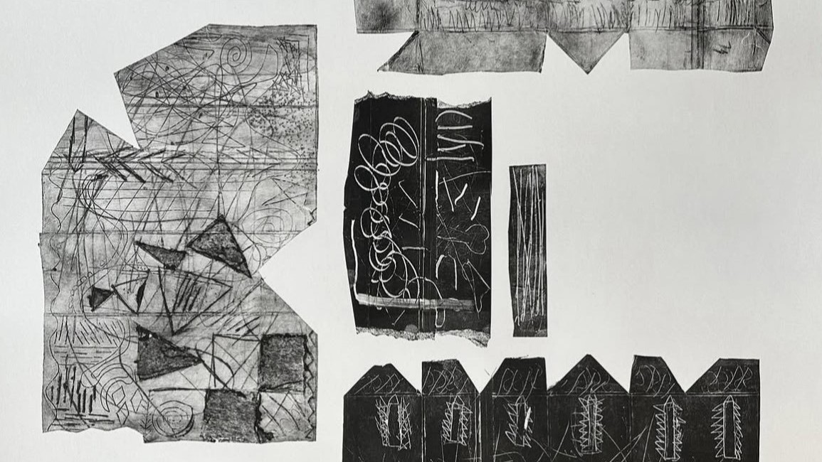
3. Chase, Kyle and Precious, Youth Futures Community School Midland, Untitled (detail), 2024, Ink monotype and drypoint print from found cardboard on paper, 84 x 59.5 cm.
Quilty’s three solo works, Car Crash (“I’m gonna call Howard Sattler”) (Safety Bay Rd), Flag Man (Frangipanis) (Axminister St), and Surf Bogan (Shark Chopper get F***ed) (Palermo Cove) are a mesmerising force. Clashing elements sit at odds to create densely layered chaos. Surf Bogan, for example, is something like a warped vignette with its careful ink shading pressing inwards from the upper right and bottom left-hand corners. Yet this gradient frame cannot contain the formal and tonal explosions that undermine the paper’s rectangular frame. This work is more portal than page. Expressive, directional linework instils the fidgety figures with movement and life. The varied marks and dense layering that renders the ambiguous subject matter, creates the impression that it cannot hold still. Scratched markings give the impression that the subject matter is uncertain in its person or objecthood, as if the disembodied screaming mouth, laser-shooting eyes, and raised middle finger only rest briefly in formation and could flicker quickly back into unrecognisable abstraction. The triad of improvised drypoint scratchings reflects what Quilty refers to as ‘outer suburban archetypes’, critical of lingering stigmatisation that outer suburban experience frequently encounters. Exhibition text explains that Flag Man and Surf Bogan describe persons the artist passed when driving to the beach. The third drypoint, Car Crash, emerges in response to an informative experience for Quilty. A single-vehicle crash tragically killed his teenage friend—incorrectly reported in the news as a stolen vehicle in accordance with negative assumptions frequently made about outer suburban youth. Quilty explains that while working as a labourer after finishing high school, his boss (who was aware of Quilty’s close friendship with the deceased) told him casually that he attended the crash as a volunteer firefighter and his friend’s body was split in half. The artist recalls ‘that he so nonchalantly shared this with me, indicated the frequency with which he attended these scenes and implied the notion that I have come across in outer suburbia: that your feelings can go and get f***ed.’
Quilty’s mundane, suburban subject matter—with works featuring metamorphosed sneakers, Quicksilver-esque designs, crucifixes, eyes, knees, mechanical parts, and waves—offers points of departure from which sets of encoded beliefs are unravelled. It is evident that Quilty has likewise encouraged students to do the same, drawing from their day-to-day experiences and trials to inform their artmaking. Visualising daily experiences—without dressing them up for viewers—is an impulse throughout the exhibition. Works feature scattered assortments of popular cartoons, barking dogs, and fast-food products in a manner that mimics the meandering jumping of conversations between close friends. Like exchanges that occur within intimate friendships, works range from addressing pressing fears—like looming financial pressures, living up to a family member’s expectations, and the drive to make sense of oneself – to trivial toss-ups like what the change in your back pocket will get you for dinner. Also apparent throughout the exhibition is the influence of the experimentalism with which Quilty approaches mark-making. Quilty’s skill as an artist is matched by his capacity to inspire and guide as an educator. The most informative class I took during my undergraduate degree was Quilty’s Drawing Foundations. Whether peppering A2 sheets with staccato, easel-rocking pencil jabs, turning the pencil around to its but and producing blunt, red-tainted impressions, or taking up the neon pastel just handed to him by a volunteer and slashing across a delicately shaded biro portrait (to a chorus of sharp, auditable gasps), his passion for the mark was infectious. It is clear in Happy Meals and Scooter Skids that the same fever has taken hold. Each work contains evidence of unique assemblages of delicately twisting wrists, careful blocking-out, haphazard rubbing, slow shading, tessellating pressure, and decisive linework.
Kaden’s Police, the first work to greet visitors, is a graphite and gouache monotype print on Fabriano paper. It contains a carefully rendered police van, complete with dark hubcaps, tinted windows, and the tell-tale checkered stripe. Yet the law-and-orderly scene is inverted in two fell swoops. Confident curves—perhaps traces of a side-held pencil or a blunt plastic item—mimic burnouts’ inconsistent scorch mark remanence. Combined with the van’s positioning in the upper third of the page, this clever variation gives the probably stolen car a burst of explosive movement. Untitled, Precious, Kyle, Chase, and Ashton’s collaborative ink monotype and drypoint print from found cardboard on paper, adopts a different approach altogether. The 84 x 59.5 cm page encloses several distinct prints that clash and harmonise in turn to create an unpredictable synthesis of implied textures. The image celebrates imperfection to indicate the past lives of the recycled material employed in the print’s making. Clearly rendered in ink, the imprint of torn paper at the centre and bottom left of the work leaves a particularly striking gradient beside jet-black ink blocks. In the prints that make up the right section of the work, carefully sketched figurative drawings tumble into abstraction through layers of interlocking linework. The experimentation continues with a series of five recycled McDonalds packaging monoprints. Rima’s Medium Fries, for example, is an ink monotype that interrupts the smooth surface of McDonald’s packaging with soft, wiggly swirls, boldly skeltered linework, and assertive fingerprints. Medium Fries sits adjacent to Kaden’s quartet of oil marker and solvent transfer on Fabriano paper, LAW and ORDER, HOME OWNER, PATROLE, and INSURANCE. Kaden, whose family Rottweiler is coincidently walked past Andy’s house most days, has created a series of striking portraits. Minimal linework and shading suggest the curves of noses, cheekbones, and tightly sealed lips or downcast eyes. Each expressive face is superimposed over images that might be grouped as outer suburban iconography, including an aging Ford, a police car, and a single-story, tree-less property with a neatly kept lawn.
A group show featuring collaborative and individual works by teenage high school students is fated to contain some variance. Remarkably, however, not a single work of the forty-five selected contains homogenous mark-making. Artistic inventiveness and creative approaches make each work an interesting and sophisticated formal investigation. This implicit playfulness should not be taken to suggest, however, that the content is not taken seriously by Quilty or the student artists. While often depicted cheekily, students’ day-to-day experiences are not dismissed as insignificant or ridiculed in a The Castle-esque manner of quasi-sincerity (to draw from Quilty’s analysis of the popular film in his masters thesis). This is felt in the pointed sense of ‘outside-in’ that characterises the exhibition, a sensation that is far from coincidental. Although holding their own as formally innovative fine art objects, it feels as if these works have been brought into the gallery space upon relocation from alternative environments, ‘out there’, to which they belong. Quilty and Andrew Nicholls’ (who worked on the show as supporting curator) use of crude construction materials to hang works further encourages one to notice the disparity between the mundane, sometimes gritty realities of outer suburban kids and the imagery that typically graces gallery walls. Is it not a curious conditionality that allows many so-called Australian gallery goers to cling to a supposedly collective (highly problematic) hills hoist heritage, yet find themselves surprised to meet such down-to-earth subject matter in a gallery context? This irony is not lost on Quilty.
Beneath the exhibition’s laid-back façade is an examination of lingering prejudice, so fittingly placed in Claremont, the beating heart of Perth’s upper classes. Quilty’s project reminds art viewers of the often-unspoken class boundaries we like to think have been dissolved. Happy Meals & Scooter Skids is a mark-making masterclass, but equally, beneath the fun and games, addresses patterns of exclusion within art world mechanisms. It asks, more simply, who is actually welcome.
Image credits:
1. Andy Quilty and Armadale Senior High School Students, Nike flowers and shopping trolley (detail), 2024, drypoint print on Fabriano paper, 76 x 56 cm.
2. Courtesy of FORM Gallery.
3. Chase, Kyle and Precious, Youth Futures Community School Midland, Untitled (detail), 2024, Ink monotype and drypoint print from found cardboard on paper, 84 x 59.5 cm.