As the sun set in radiant hues over the Perth skyline, a handful of individuals gathered in a balconied double room twelve floors up at the South Perth Metro Hotel. The stunning sunset was incidental. We weren’t there to marvel at the day dissolving to dusk, but to see a surreptitiously and illicitly installed art exhibition.
Taking place on the same weekend as the Spring1883 Art Fair at the Hotel Windsor in Melbourne, (August 11) David Attwood and Daniel Argyle’s “unsanctioned” show was the antithesis and antidote to the commercialised schmutz of Melbournites’ current gentle and gentrified contemporary x trendy aesthetic bent. The scrambled visuals of Spring1883 can best be described as a deluge of un-picked objects coated in slick references to surveillance capitalism, obscure theories, and post-identity redemption politics. If deskilled figuration is the painterly trend of our times, one is hard-pressed to identify the sculptural equivalent. Disinterested assemblage perhaps?
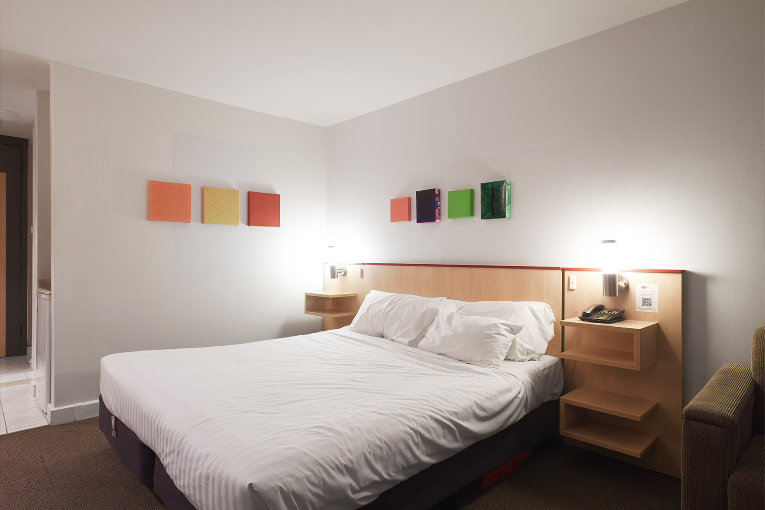
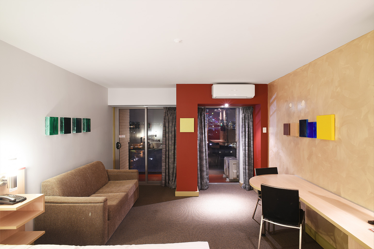
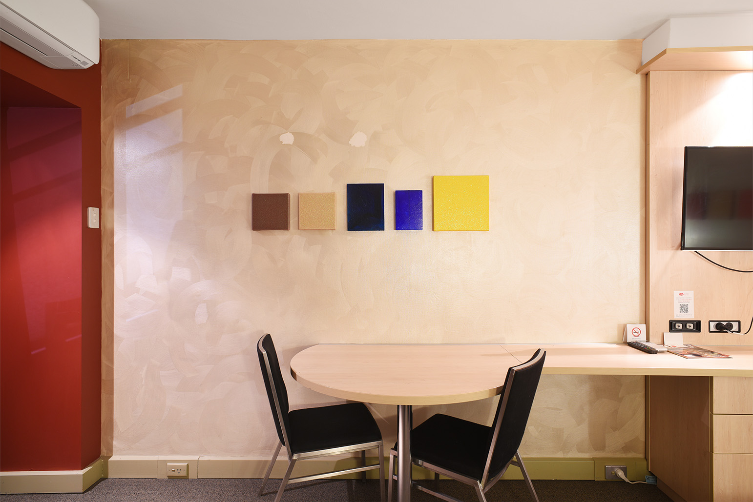
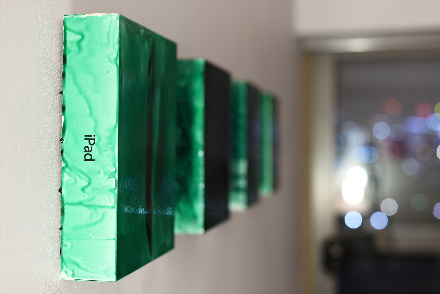
Metro Hotel remixed the above terms with a series of readymades and hand-stretched canvases, formally falling somewhere between modernist painting and 21st century combines. Replacing the hotel’s original wall art, the works of Disneyland Paris founder David Attwood and accomplice Daniel Argyle were well-paired in the beige-and-maroon-hued sweatbox. Attwood took something lurking in all of our houses, under all of our beds, stashed in all our cupboards; the humble and un-throw-out-able Apple packaging box, uglified ad nauseum on the wall, its rectangular polyhedrons transformed into something holier. Argyle’s paintings—formless glitter colour fields rethinking flatness and palpitating with weird tonalities—were perfect companions. The works both warped and adorned the room, a testament to the extremely precise, yet clandestine, installation, exemplified perfectly when one painting spontaneously fell down (Command Strips, much like the Capitalist State, may also be said to always be “inscribed with the possibility of imminent collapse”).
Recently and coincidentally, a day or so before the show, I saw a TikTok (on Instagram) about someone’s personal journey towards throwing out Apple product packages. The video’s caption read along the lines of “I finally did it”: cue an overweight, dishevelled individual in a pink hoodie, twirling balletically to orchestral backing music, spinning gleefully as they opened the bin and tossed the boxes into the trash. The video resurfaced in my mind as I perused the room. Hunting for the exact clip to link in this article, my search of TikTok (sans a login) revealed that this trend is a much-discussed millennial topic, with a host of other videos captioned:
and
where the first is to store them under a clothes rack, and the second is to throw them in the recycling (see also the 2021 Vice Article Why Do People Keep Their Empty Apple Boxes?).
Attwood’s readymade-paintings offer an alternative to these videos’ glib humour and self-referential irony, at once reifying and confronting our obsession with such omnipresent technology—the lithium battery-powered communication devices in all of our pockets, on most of our wrists, used by all of us to snap photos of the show as we crammed into the too-hot room, and by me as I type this review. The coatings of the Apple boxes in dark-coloured but transparent PVC cement were akin to insects or leaves caught in amber—strange, surreal, prehistoric oddities captured in time, now frozen in the hotel-cum-gallery room. Daniel Argyle’s glitter paintings were even stranger: layered with dozens of almost invisible tinted mixes, surfaces like pumice or poultice, arriving at an odd sense of space. Glittery, deep, flat, beige, muted, their tones were all off-kilter or filtered somehow, like Argyle had invented his own Perth Pantone Palette. These odd capitalist-sci-fi landscapes, celestial and lightsome, were the inverse of any Lucio Fontana.
Another strange coincidence: recently, fellow Dispatch editor Sam Beard and I had encountered a bright-hued glitter painting by Pat Larter included in AGWA’s recent Spacingout exhibition. This interaction prompted a lengthy debate between us on the drive home, asking and re-asking each other what exactly is glitter art? Our discussion then, like the room, was also uncomfortably heated: was this work of its time or timeless? Did it represent any kind of artistic achievement or was it better placed as an interesting material experiment? Did I only like it because it was shiny?
TikTokademics too have debated this question, from a new materialist point of view: the much-circulated trend of #whatisglitter is virtually unavoidable. Across history, from cosmetics to art, glitter is everywhere—in prehistoric mica flakes (a type of silicate mineral) used by ancient Mayans; crushed beetles as used by ancient Egyptians; powdered hematite; to 1934’s ground-up plastic coated in glass, invented by an American machinist, made with a device used to cut film. On and in fishing lures, toy unicorns, nail polish, and even some countries’ paper currency, glitter is everywhere, so why not contemporary art?
Modern glitter is in fact a by-product, an accident now produced and celebrated (or sold to signify celebration) worldwide. Much like the packaging used to ship and protect our Apple devices, it has developed its own lore, or aura, requiring its own coded language to express. As wonderfully described by the son of its maker, Henry W. Ruschmann: “The cutting machine occasionally “stuttered”, depositing glossy cellulose/paper “schnibbles” on the shop floor—until some employees got the idea of taking them home and using them as “snow” in Christmas decorations.” See also the 2007 NY Mag article Glitter: A Brief History, which comes under the ‘Shopping Features’ section of the magazine.
Upon relaying some of these facts in a convoluted stream-of-consciousness info-dump to Argyle at the Metro opening, he politely informed me that he mixes his own bio-friendly glitter into resin and PVA, coloured and not, which becomes somewhat dulled by the inclusion of pigment. Upon looking at the works a second and third time, this clouded effect seemed perfectly obvious.
What was still elusive to me was this question: Why on earth would anyone reasonably show artwork that demanded its audience gather a dozen or more floors up in a tiny, sweaty, awkward hotel room that required chaperoning in with Dave’s overnight keycard and not making eye contact with any desk staff on the elevator ascent? The disruption was palpably uncomfortable.
Alleviating my disdain, Dave casually explained that The Metro Hotel is the only high-rise building in its neighbourhood on Canning Highway, one he often sees on his work commute. Unavoidably marvelling almost daily at this bland oddity of architecture and locale, the exhibition gamut became not why, but why not?
The longer I stayed, the more this interventionist logic made sense: situating paintings at the Metro, with the ghostly marks of the hotel’s own mass-produced art imprinted on the sun-bleached walls (the actual works stashed under the bed) was not just plausible, but somehow effective. Add the novelty of the exhibition room sheet printed on Hotel header paper and having to SMS to get an entry spot, and the formula was now winning.
Of course, too, there was the Spring1883 connection. Simultaneously, the eighth edition of Melbourne’s premier art fair saw “twenty-eight leading galleries showcasing the best contemporary art from the region… across the four luxurious levels of Melbourne’s grandest heritage hotel.”
The self-christened “young and exciting” Spring1883, in adopting “the context” of the “cherished” Windsor Hotel, calls itself “a boutique site for dialogue and interaction between galleries, artists, and collectors.” Boasting $15 a day tickets, save for the VIP event (which was invitation only), Spring1883 itself takes heed from the art fair previously held at the Gramercy Park Hotel, New York—a building nearby the titular private park, where neighbours pay an annual fee for access and the locks are changed every year. Today, it is better known as the Armory Show, which, in July 2023, was acquired by international Art Fair Juggernaut Frieze. The good folks at Memo Review have said all there is to say about Spring. I don’t think anyone has ever or will ever call the Metro Hotel on Canning Highway “cherished”. But as one attendee at Metro remarked of the interaction of the sunset and the setting, “this couldn’t be any more Perth.”
While thankful that at least Hotel Metro was free, the questions of whether Attwood was passively conveying or actively structuring any anti-capitalist sentiments in his object-painting interventions, and if or why I expected him to, remained open. Certainly, the themes in Attwood’s and Argyle’s works of production and consumption, artistic accomplishment, brand allegiance, waste, and repurposing militated against each another and their audience. Indifferent to any determined narrative; ‘making a point’; functioning as status symbol; commodity fetishes; eschewing both formalism and representation—neither the materiality nor the ideality of these works was fully intact. But geez, they looked good upon that suede-textured, pale-gold feature wall whilst they were up.
David Atttwood and Daniel Argyle, Metro Hotel, Metro Hotel South Perth, 61 Canning Hwy, South Perth, WA, 6151
Images courtesy of David Attwood.
Taking place on the same weekend as the Spring1883 Art Fair at the Hotel Windsor in Melbourne, (August 11) David Attwood and Daniel Argyle’s “unsanctioned” show was the antithesis and antidote to the commercialised schmutz of Melbournites’ current gentle and gentrified contemporary x trendy aesthetic bent. The scrambled visuals of Spring1883 can best be described as a deluge of un-picked objects coated in slick references to surveillance capitalism, obscure theories, and post-identity redemption politics. If deskilled figuration is the painterly trend of our times, one is hard-pressed to identify the sculptural equivalent. Disinterested assemblage perhaps?
Metro Hotel remixed the above terms with a series of readymades and hand-stretched canvases, formally falling somewhere between modernist painting and 21st century combines. Replacing the hotel’s original wall art, the works of Disneyland Paris founder David Attwood and accomplice Daniel Argyle were well-paired in the beige-and-maroon-hued sweatbox. Attwood took something lurking in all of our houses, under all of our beds, stashed in all our cupboards; the humble and un-throw-out-able Apple packaging box, uglified ad nauseum on the wall, its rectangular polyhedrons transformed into something holier. Argyle’s paintings—formless glitter colour fields rethinking flatness and palpitating with weird tonalities—were perfect companions. The works both warped and adorned the room, a testament to the extremely precise, yet clandestine, installation, exemplified perfectly when one painting spontaneously fell down (Command Strips, much like the Capitalist State, may also be said to always be “inscribed with the possibility of imminent collapse”).
Recently and coincidentally, a day or so before the show, I saw a TikTok (on Instagram) about someone’s personal journey towards throwing out Apple product packages. The video’s caption read along the lines of “I finally did it”: cue an overweight, dishevelled individual in a pink hoodie, twirling balletically to orchestral backing music, spinning gleefully as they opened the bin and tossed the boxes into the trash. The video resurfaced in my mind as I perused the room. Hunting for the exact clip to link in this article, my search of TikTok (sans a login) revealed that this trend is a much-discussed millennial topic, with a host of other videos captioned:
Why does Apple go so hard on their iPhone boxes
Cleaning my room to convince myself I don’t need my old Apple boxes
and
What normal people do with their Apple boxes vs psychopaths
where the first is to store them under a clothes rack, and the second is to throw them in the recycling (see also the 2021 Vice Article Why Do People Keep Their Empty Apple Boxes?).
Attwood’s readymade-paintings offer an alternative to these videos’ glib humour and self-referential irony, at once reifying and confronting our obsession with such omnipresent technology—the lithium battery-powered communication devices in all of our pockets, on most of our wrists, used by all of us to snap photos of the show as we crammed into the too-hot room, and by me as I type this review. The coatings of the Apple boxes in dark-coloured but transparent PVC cement were akin to insects or leaves caught in amber—strange, surreal, prehistoric oddities captured in time, now frozen in the hotel-cum-gallery room. Daniel Argyle’s glitter paintings were even stranger: layered with dozens of almost invisible tinted mixes, surfaces like pumice or poultice, arriving at an odd sense of space. Glittery, deep, flat, beige, muted, their tones were all off-kilter or filtered somehow, like Argyle had invented his own Perth Pantone Palette. These odd capitalist-sci-fi landscapes, celestial and lightsome, were the inverse of any Lucio Fontana.
Another strange coincidence: recently, fellow Dispatch editor Sam Beard and I had encountered a bright-hued glitter painting by Pat Larter included in AGWA’s recent Spacingout exhibition. This interaction prompted a lengthy debate between us on the drive home, asking and re-asking each other what exactly is glitter art? Our discussion then, like the room, was also uncomfortably heated: was this work of its time or timeless? Did it represent any kind of artistic achievement or was it better placed as an interesting material experiment? Did I only like it because it was shiny?
TikTokademics too have debated this question, from a new materialist point of view: the much-circulated trend of #whatisglitter is virtually unavoidable. Across history, from cosmetics to art, glitter is everywhere—in prehistoric mica flakes (a type of silicate mineral) used by ancient Mayans; crushed beetles as used by ancient Egyptians; powdered hematite; to 1934’s ground-up plastic coated in glass, invented by an American machinist, made with a device used to cut film. On and in fishing lures, toy unicorns, nail polish, and even some countries’ paper currency, glitter is everywhere, so why not contemporary art?
Modern glitter is in fact a by-product, an accident now produced and celebrated (or sold to signify celebration) worldwide. Much like the packaging used to ship and protect our Apple devices, it has developed its own lore, or aura, requiring its own coded language to express. As wonderfully described by the son of its maker, Henry W. Ruschmann: “The cutting machine occasionally “stuttered”, depositing glossy cellulose/paper “schnibbles” on the shop floor—until some employees got the idea of taking them home and using them as “snow” in Christmas decorations.” See also the 2007 NY Mag article Glitter: A Brief History, which comes under the ‘Shopping Features’ section of the magazine.
Upon relaying some of these facts in a convoluted stream-of-consciousness info-dump to Argyle at the Metro opening, he politely informed me that he mixes his own bio-friendly glitter into resin and PVA, coloured and not, which becomes somewhat dulled by the inclusion of pigment. Upon looking at the works a second and third time, this clouded effect seemed perfectly obvious.
What was still elusive to me was this question: Why on earth would anyone reasonably show artwork that demanded its audience gather a dozen or more floors up in a tiny, sweaty, awkward hotel room that required chaperoning in with Dave’s overnight keycard and not making eye contact with any desk staff on the elevator ascent? The disruption was palpably uncomfortable.
Alleviating my disdain, Dave casually explained that The Metro Hotel is the only high-rise building in its neighbourhood on Canning Highway, one he often sees on his work commute. Unavoidably marvelling almost daily at this bland oddity of architecture and locale, the exhibition gamut became not why, but why not?
The longer I stayed, the more this interventionist logic made sense: situating paintings at the Metro, with the ghostly marks of the hotel’s own mass-produced art imprinted on the sun-bleached walls (the actual works stashed under the bed) was not just plausible, but somehow effective. Add the novelty of the exhibition room sheet printed on Hotel header paper and having to SMS to get an entry spot, and the formula was now winning.
Of course, too, there was the Spring1883 connection. Simultaneously, the eighth edition of Melbourne’s premier art fair saw “twenty-eight leading galleries showcasing the best contemporary art from the region… across the four luxurious levels of Melbourne’s grandest heritage hotel.”
The self-christened “young and exciting” Spring1883, in adopting “the context” of the “cherished” Windsor Hotel, calls itself “a boutique site for dialogue and interaction between galleries, artists, and collectors.” Boasting $15 a day tickets, save for the VIP event (which was invitation only), Spring1883 itself takes heed from the art fair previously held at the Gramercy Park Hotel, New York—a building nearby the titular private park, where neighbours pay an annual fee for access and the locks are changed every year. Today, it is better known as the Armory Show, which, in July 2023, was acquired by international Art Fair Juggernaut Frieze. The good folks at Memo Review have said all there is to say about Spring. I don’t think anyone has ever or will ever call the Metro Hotel on Canning Highway “cherished”. But as one attendee at Metro remarked of the interaction of the sunset and the setting, “this couldn’t be any more Perth.”
While thankful that at least Hotel Metro was free, the questions of whether Attwood was passively conveying or actively structuring any anti-capitalist sentiments in his object-painting interventions, and if or why I expected him to, remained open. Certainly, the themes in Attwood’s and Argyle’s works of production and consumption, artistic accomplishment, brand allegiance, waste, and repurposing militated against each another and their audience. Indifferent to any determined narrative; ‘making a point’; functioning as status symbol; commodity fetishes; eschewing both formalism and representation—neither the materiality nor the ideality of these works was fully intact. But geez, they looked good upon that suede-textured, pale-gold feature wall whilst they were up.
David Atttwood and Daniel Argyle, Metro Hotel, Metro Hotel South Perth, 61 Canning Hwy, South Perth, WA, 6151
Images courtesy of David Attwood.
