From: Sam Beard <redacted@yahoo.com>
Date: Fri, 21 July 2023 at 14:11
Subject: Hatched Dispatched
To: Aimee Dodds <redacted@protonmail.com>
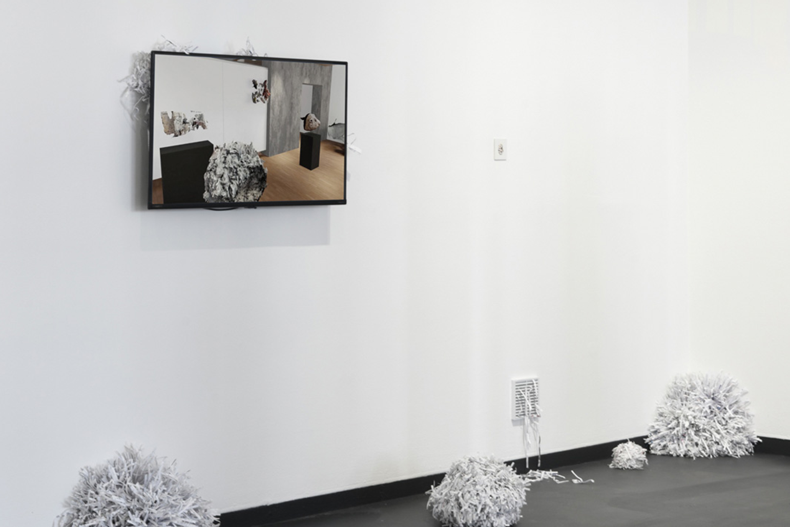
Shit! Aimee, aren’t we meant to write about Hatched!? You mentioned co-writing a review? Let’s do it. Yesterday, I visited the show and was intrigued to see Agatha Okon’s video again. I first saw it at UWA's graduate exhibition. It caught me off guard. Lately, I find conversations about virtual realities, AI and Meta worlds tiresome. Often, art about such topics are tiresome too. I’ve noticed myself avoiding art about these themes—perhaps I’m not looking to art for insights, but for respite? Nonetheless I was impressed by Okon’s video. Why? It synthesises these discordant feelings. The janky, overtly “digital” qualities of the video are, simultaneously, what makes it intriguing and off-putting—hitting an uneasy sweet-spot. When I first saw it at the Cullity Gallery it was a thrilling watch. The video’s strange, uneasy flight through a virtually reconstructed Cullity was trippy (a tad Big Brother?); it was like watching a video-call taking place at an exhibition that never existed while standing in that very same gallery—impossible! The virtual and the real colliding in real time. It’s a clever doubling. Wisely, Okon avoided the temptation to overtly dwell on the meta-meanings at play and instead offered up an alluring, obscure and entertaining vision for us to contemplate and come to our own conclusions about. In Hatched, there is not the same doubling of a virtual and real space as when show in Cullity. Regardless, the work holds up—a testament to Okon's digital skills and sensibilities. However, are the paper pom poms really necessary? I am not so sure. Especially since the bridging of the virtual and material worlds persists without their addition. I look forward to seeing how Okon develops this further. What do you reckon?
From: Aimee Dodds <redacted@protonmail.com>
Date: Fri, 21 July 2023 at 14:34
Subject: RE Hatched Dispatched
To: Sam Beard <redacted@yahoo.com>
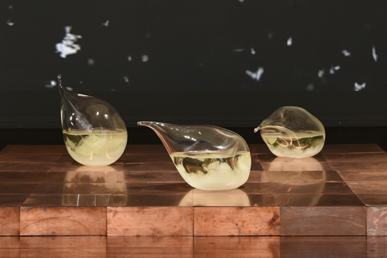
OMG! You’re right Sam. Alright, sounds good to me. I just saw the show, and am at the bar now. While I too am intrigued by Okon's work, perhaps your fascination is a sign of age—you are a bit of a Luddite, no? When I watch a video work, I want to be transported. In this respect, I recommend wandering downstairs to see the installation Forecasting the touch of change by Anna May Kirk. This enveloping room displays three strange raindrop-esque glass forms on a low platform of copper, in places oxidised to a dull teal, its edges eaten away by the most beautiful blue patina. The gallery resounds with glacial recordings, and the entire wall behind this tripartite sculpture shows a mesmerising video of dark water crystals undulating on a screen, a microscopic perspective blown-up until it is metres across—a larger than life icy landscape. The organic sculpted shapes are frosted with an unsettling milky-shaded creaminess; it turns out they are storm glass; anachronistic, from another time (much like yourself). These works, I think, represent a lost way of being-in-the-world that has been superseded by screens displaying the BOM forecast and a sun emoji. I have never understood why small talk about the weather is considered boring—it is quite essential to existence, how we dress every day, how much we complain and what about, and I have noticed that the badder art critics will start reviews or books with “it was a sunny day when I wandered into the gallery” if they are lost for some other critical starting point. Sally Olds has a good bit about this in People who Lunch. Anywho, I hope the atmospheric pressure doesn’t get to your head too much.
From: Sam Beard <redacted@yahoo.com>
Date: Fri, 21 July 2023 at 14:53
Subject: RE Hatched Dispatched
To: Aimee Dodds <redacted@protonmail.com>
Lol! Don’t rubbish hybrid essays if we’re about to write one! Actually, no, we SHOULD rubbish hybrid essays, then write one, thus fulfilling the ultimate hybrid form—et voila! Impenetrable! Speaking of impenetrable, I remember the work you are describing, downstairs, in one of the dim dens. Not for me. Go have a look at Soile Paloheimo's work (with its pulsating lines of colour, perhaps you can extrapolate something about the weather—they do look like isobars after all!). Personally, I find the impetus to Paloheimo's work—no matter how thoughtfully described on the wall label—at odds with the pulsing shock of lights and colours that bounce across these three projections. Paloheimo describes how the work riffs off the experience of isolation after finding oneself in a new place, grappling with a new language. Yet, standing in all the wavey light, sometimes soothing, sometimes dizzying, it FEELS like pure atmosphere, something visceral, hardly related to the remote and abstract experience of unfamiliar languages. Regardless—I’m hooked! While I do not quite "see" the link between Paloheimo's inspiration and the reality of the work, I am glad she did and arrived at this result.
From: Aimee Dodds <redacted@protonmail.com>
Date: Fri, 21 July 2023 at 15:14
Subject: RE Hatched Dispatched
To: Sam Beard <redacted@yahoo.com>
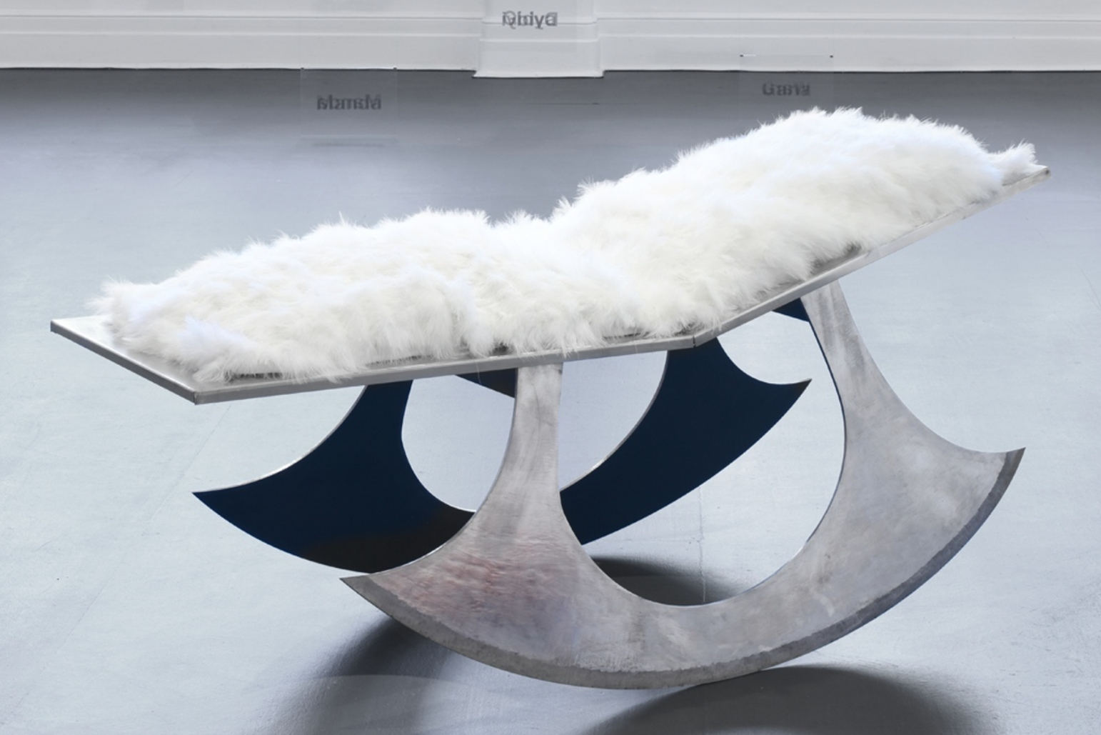
You must have spent more time at the nightclubs than the art galleries in Melbourne, or perhaps you can no longer tell the difference? (or perhaps there no longer is a difference…) What is one to do in this post-Guzzler age? Paloheimo’s installation made me nauseous, far too much stimulation, which I guess is a testament to its success if not its intended effect—maybe there’s your link to being surrounded by a foreign language, the inconsistency between exhibition and description! Can I interest you in one of Bryce Olsen’s? The choice is threefold: a pointy hard-edge wooden Gothic-looking throne; a furry cradle-rocker, delicately balanced on two sharp blades; or a squishy pink acrylic number. I saw these works as maquettes at Artsource last year. At full scale they are imposing and intriguing. Personally, I was most taken by the Church-like throne: domineering, precise, and overbearing, it is much too high to actually sit on and is instead an object of stark beauty. The blade blanket ensemble offers a nice material and visual contrast between deathly sharp steel and soft white fluffiness, collapsing ideas of danger and recreation – although you seem to do this well enough yourself on weekends! The pink chair is more contained and containing, the clear acrylics matched with satin fabric adorned with surface texture like scars or stretch marks. You wouldn’t really want to sit in any of these chairs, even though you technically could. They blur the line between design and art, practicality and ridiculousness aestheticism, form and function without being too self-conscious or annunciatory about it. I think the artist was interested in Freud and ideas of the id, ego and superego, but these kind of escaped me in favour of the aesthetic precision. As another famous artist once said, “Freud is unnecessary to the future.” That artist was Mina Loy. You should look her up if you haven’t already taken my dozen other hints to do so. Cheerio.
From: Sam Beard <redacted@yahoo.com>
Date: Fri, 21 July 2023 at 15:34
Subject: RE Hatched Dispatched
To: Aimee Dodds <redacted@protonmail.com>
Aimee, you know I declined my invitation to Breakfast Club… and I think I will also decline your suggestion of Mina once more! I preferred looking at Chris Siu's photographs. They were immediately arresting, suspenseful, and pensive in their quiet nature—like stills from a neo-noir film that never was. Admittedly I am tired of “Covid artwork” (maybe now I understand why there was precious little artwork about the Spanish flu, even though so many canonical figures of art and literature lived and made work during that pandemic). But this is not “Covid artwork”, nor should it be misread as such. Sensitively and visually, Siu conjures the undercurrent of unease that permeated the political unrest in Hong Kong since 2019, and the acceleration of uncertainty that ensued during the covid-years, and the seismic shifts in the Australia-China relationship—all executed in five subtle black and white photographs. I do not do Siu’s photos justice here. Instead, I suggest you go have a gander yourself.
From: Aimee Dodds <redacted@protonmail.com>
Date: Fri, 21 July 2023 at 15:47
Subject: RE Hatched Dispatched
To: Sam Beard <redacted@yahoo.com>
Sam, I am going to admit something: I simply detest work that is in black-and-white, I don’t understand why so many artists use it. The world is not black and white, which is often used as a cliché to illustrate the idea that nuance is important, but I literally mean it literally—we see in colour! Of course, unless you’re colourblind, or a dog, but even then, it would seem to be a funny mix of brown and green tones, and not fifty shades of grey. I was more inspired by the delightfully colourful range of ceramics, Trophy #3-#30 by Nathan Nhan. A series of sculptures-cum-trophies, and trophy-like vessels whose de-skilled and varicoloured forms displayed an impressive array of patterns and glazes, occasionally ugly or bloated or excessive but always with an appealing surface texture. Every time I looked and circled round them, I would notice some new protrusion or extrusion from their blobby forms. They were masterfully arranged at a perfect height and layout (nicely done, Brent Harrison) in what was probably one of the best displays of ceramics I’ve seen lately. Both functional and formal, these works smudged the line between decorative and utilitarian, drawing out ideas about the things we keep and the things we throw away. A transferrable lesson Sam—you should vacuum. Anyway, I will say that there was much more good art than bad in Hatched, too much to talk about here, but I certainly don’t agree with your aesthetic judgements anymore than I do with your opinions on Mina or flu art. Shall we catch up properly to write this thing? There's only a week left of the show, we should get it out soon.
From: Sam Beard <redacted@yahoo.com>
Date: Fri, 21 July 2023 at 16:53
Subject: RE Hatched Dispatched
To: Aimee Dodds <redacted@protonmail.com>
Roger that! Beer Friday?
Best,
Sam
Hatched: National Graduate Show 2023, 13 May - 23 July 2023, Perth Institute of Contemporary Arts.
Image credits:
1. Bryce Olsen, That tender place (rocking chair), 2022, polished steel, aluminium, feathers, textiles and spray paint, 85 x 64 x 185 cm.
2. Agatha Okon, Outside of truth 2022, single-channel video and scrap paper, 4:22 mins.
3. Anna May Kirk, Forecasting the touch of change, 2022, hand-blown glass ‘breaths’ permanently sealed with 19th-century storm glass chemical composition, oxidising copper tiles, 180 x 180 x 10 cm.
Date: Fri, 21 July 2023 at 14:11
Subject: Hatched Dispatched
To: Aimee Dodds <redacted@protonmail.com>
Shit! Aimee, aren’t we meant to write about Hatched!? You mentioned co-writing a review? Let’s do it. Yesterday, I visited the show and was intrigued to see Agatha Okon’s video again. I first saw it at UWA's graduate exhibition. It caught me off guard. Lately, I find conversations about virtual realities, AI and Meta worlds tiresome. Often, art about such topics are tiresome too. I’ve noticed myself avoiding art about these themes—perhaps I’m not looking to art for insights, but for respite? Nonetheless I was impressed by Okon’s video. Why? It synthesises these discordant feelings. The janky, overtly “digital” qualities of the video are, simultaneously, what makes it intriguing and off-putting—hitting an uneasy sweet-spot. When I first saw it at the Cullity Gallery it was a thrilling watch. The video’s strange, uneasy flight through a virtually reconstructed Cullity was trippy (a tad Big Brother?); it was like watching a video-call taking place at an exhibition that never existed while standing in that very same gallery—impossible! The virtual and the real colliding in real time. It’s a clever doubling. Wisely, Okon avoided the temptation to overtly dwell on the meta-meanings at play and instead offered up an alluring, obscure and entertaining vision for us to contemplate and come to our own conclusions about. In Hatched, there is not the same doubling of a virtual and real space as when show in Cullity. Regardless, the work holds up—a testament to Okon's digital skills and sensibilities. However, are the paper pom poms really necessary? I am not so sure. Especially since the bridging of the virtual and material worlds persists without their addition. I look forward to seeing how Okon develops this further. What do you reckon?
From: Aimee Dodds <redacted@protonmail.com>
Date: Fri, 21 July 2023 at 14:34
Subject: RE Hatched Dispatched
To: Sam Beard <redacted@yahoo.com>
OMG! You’re right Sam. Alright, sounds good to me. I just saw the show, and am at the bar now. While I too am intrigued by Okon's work, perhaps your fascination is a sign of age—you are a bit of a Luddite, no? When I watch a video work, I want to be transported. In this respect, I recommend wandering downstairs to see the installation Forecasting the touch of change by Anna May Kirk. This enveloping room displays three strange raindrop-esque glass forms on a low platform of copper, in places oxidised to a dull teal, its edges eaten away by the most beautiful blue patina. The gallery resounds with glacial recordings, and the entire wall behind this tripartite sculpture shows a mesmerising video of dark water crystals undulating on a screen, a microscopic perspective blown-up until it is metres across—a larger than life icy landscape. The organic sculpted shapes are frosted with an unsettling milky-shaded creaminess; it turns out they are storm glass; anachronistic, from another time (much like yourself). These works, I think, represent a lost way of being-in-the-world that has been superseded by screens displaying the BOM forecast and a sun emoji. I have never understood why small talk about the weather is considered boring—it is quite essential to existence, how we dress every day, how much we complain and what about, and I have noticed that the badder art critics will start reviews or books with “it was a sunny day when I wandered into the gallery” if they are lost for some other critical starting point. Sally Olds has a good bit about this in People who Lunch. Anywho, I hope the atmospheric pressure doesn’t get to your head too much.
From: Sam Beard <redacted@yahoo.com>
Date: Fri, 21 July 2023 at 14:53
Subject: RE Hatched Dispatched
To: Aimee Dodds <redacted@protonmail.com>
Lol! Don’t rubbish hybrid essays if we’re about to write one! Actually, no, we SHOULD rubbish hybrid essays, then write one, thus fulfilling the ultimate hybrid form—et voila! Impenetrable! Speaking of impenetrable, I remember the work you are describing, downstairs, in one of the dim dens. Not for me. Go have a look at Soile Paloheimo's work (with its pulsating lines of colour, perhaps you can extrapolate something about the weather—they do look like isobars after all!). Personally, I find the impetus to Paloheimo's work—no matter how thoughtfully described on the wall label—at odds with the pulsing shock of lights and colours that bounce across these three projections. Paloheimo describes how the work riffs off the experience of isolation after finding oneself in a new place, grappling with a new language. Yet, standing in all the wavey light, sometimes soothing, sometimes dizzying, it FEELS like pure atmosphere, something visceral, hardly related to the remote and abstract experience of unfamiliar languages. Regardless—I’m hooked! While I do not quite "see" the link between Paloheimo's inspiration and the reality of the work, I am glad she did and arrived at this result.
From: Aimee Dodds <redacted@protonmail.com>
Date: Fri, 21 July 2023 at 15:14
Subject: RE Hatched Dispatched
To: Sam Beard <redacted@yahoo.com>
You must have spent more time at the nightclubs than the art galleries in Melbourne, or perhaps you can no longer tell the difference? (or perhaps there no longer is a difference…) What is one to do in this post-Guzzler age? Paloheimo’s installation made me nauseous, far too much stimulation, which I guess is a testament to its success if not its intended effect—maybe there’s your link to being surrounded by a foreign language, the inconsistency between exhibition and description! Can I interest you in one of Bryce Olsen’s? The choice is threefold: a pointy hard-edge wooden Gothic-looking throne; a furry cradle-rocker, delicately balanced on two sharp blades; or a squishy pink acrylic number. I saw these works as maquettes at Artsource last year. At full scale they are imposing and intriguing. Personally, I was most taken by the Church-like throne: domineering, precise, and overbearing, it is much too high to actually sit on and is instead an object of stark beauty. The blade blanket ensemble offers a nice material and visual contrast between deathly sharp steel and soft white fluffiness, collapsing ideas of danger and recreation – although you seem to do this well enough yourself on weekends! The pink chair is more contained and containing, the clear acrylics matched with satin fabric adorned with surface texture like scars or stretch marks. You wouldn’t really want to sit in any of these chairs, even though you technically could. They blur the line between design and art, practicality and ridiculousness aestheticism, form and function without being too self-conscious or annunciatory about it. I think the artist was interested in Freud and ideas of the id, ego and superego, but these kind of escaped me in favour of the aesthetic precision. As another famous artist once said, “Freud is unnecessary to the future.” That artist was Mina Loy. You should look her up if you haven’t already taken my dozen other hints to do so. Cheerio.
From: Sam Beard <redacted@yahoo.com>
Date: Fri, 21 July 2023 at 15:34
Subject: RE Hatched Dispatched
To: Aimee Dodds <redacted@protonmail.com>
Aimee, you know I declined my invitation to Breakfast Club… and I think I will also decline your suggestion of Mina once more! I preferred looking at Chris Siu's photographs. They were immediately arresting, suspenseful, and pensive in their quiet nature—like stills from a neo-noir film that never was. Admittedly I am tired of “Covid artwork” (maybe now I understand why there was precious little artwork about the Spanish flu, even though so many canonical figures of art and literature lived and made work during that pandemic). But this is not “Covid artwork”, nor should it be misread as such. Sensitively and visually, Siu conjures the undercurrent of unease that permeated the political unrest in Hong Kong since 2019, and the acceleration of uncertainty that ensued during the covid-years, and the seismic shifts in the Australia-China relationship—all executed in five subtle black and white photographs. I do not do Siu’s photos justice here. Instead, I suggest you go have a gander yourself.
From: Aimee Dodds <redacted@protonmail.com>
Date: Fri, 21 July 2023 at 15:47
Subject: RE Hatched Dispatched
To: Sam Beard <redacted@yahoo.com>
Sam, I am going to admit something: I simply detest work that is in black-and-white, I don’t understand why so many artists use it. The world is not black and white, which is often used as a cliché to illustrate the idea that nuance is important, but I literally mean it literally—we see in colour! Of course, unless you’re colourblind, or a dog, but even then, it would seem to be a funny mix of brown and green tones, and not fifty shades of grey. I was more inspired by the delightfully colourful range of ceramics, Trophy #3-#30 by Nathan Nhan. A series of sculptures-cum-trophies, and trophy-like vessels whose de-skilled and varicoloured forms displayed an impressive array of patterns and glazes, occasionally ugly or bloated or excessive but always with an appealing surface texture. Every time I looked and circled round them, I would notice some new protrusion or extrusion from their blobby forms. They were masterfully arranged at a perfect height and layout (nicely done, Brent Harrison) in what was probably one of the best displays of ceramics I’ve seen lately. Both functional and formal, these works smudged the line between decorative and utilitarian, drawing out ideas about the things we keep and the things we throw away. A transferrable lesson Sam—you should vacuum. Anyway, I will say that there was much more good art than bad in Hatched, too much to talk about here, but I certainly don’t agree with your aesthetic judgements anymore than I do with your opinions on Mina or flu art. Shall we catch up properly to write this thing? There's only a week left of the show, we should get it out soon.
From: Sam Beard <redacted@yahoo.com>
Date: Fri, 21 July 2023 at 16:53
Subject: RE Hatched Dispatched
To: Aimee Dodds <redacted@protonmail.com>
Roger that! Beer Friday?
Best,
Sam
Hatched: National Graduate Show 2023, 13 May - 23 July 2023, Perth Institute of Contemporary Arts.
Image credits:
1. Bryce Olsen, That tender place (rocking chair), 2022, polished steel, aluminium, feathers, textiles and spray paint, 85 x 64 x 185 cm.
2. Agatha Okon, Outside of truth 2022, single-channel video and scrap paper, 4:22 mins.
3. Anna May Kirk, Forecasting the touch of change, 2022, hand-blown glass ‘breaths’ permanently sealed with 19th-century storm glass chemical composition, oxidising copper tiles, 180 x 180 x 10 cm.